Innovations follow one another on the Android TV version of YouTube to make its use more fluid. Like this very ingenious new button.
Nowadays, many users use Android TV to watch YouTube videos. Even though this application has still significant progress to be made to be perfectly functional on this type of television.
But fortunately, the developers at YouTube are working tirelessly to make improvements and ensure that navigation becomes more and more simple. They have also taken a big step forward with the launch of a new button that motivates users to subscribe to their favorite channels. We explain everything to you.
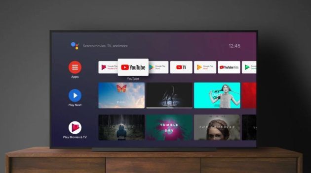

A YouTube interface that gains clarity on Android TV
Smart TV users probably know: the YouTube application is very different compared to the Web, Android and iOS versions. It must be said that everything is optimized for navigate using a remote controlwhich is necessarily less practical than with a mouse for example.
But despite this obvious constraint, it is clear that YouTube makes great efforts to make its use as intuitive as possible. In recent times, it has notably welcomed a brand new 2-column layout which displays both the video, as well as comments and information about the channel in question. Practical.
And obviously, to be able to “scratch” a little money when a video is paused, the application will also display a static advertisementuntil the user restarts the video. Yes, all means are good to be able to squeeze in a few announcements here and there…
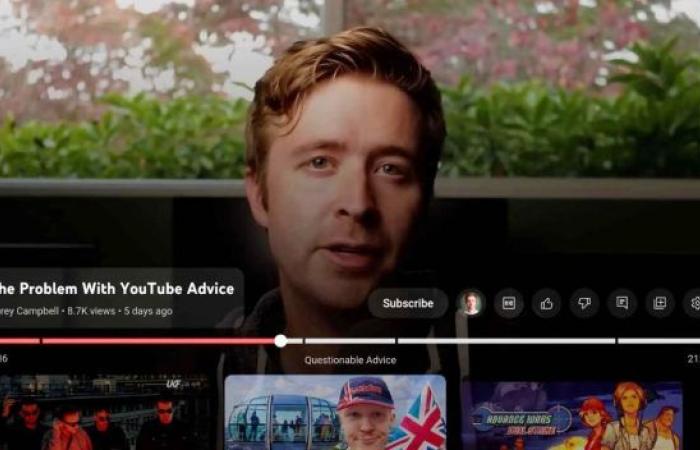
But if there is one new thing that has been making a lot of noise for some time, it is undoubtedly the arrival of a “Subscribe” button that users cannot miss. An option that could help videographers attract a larger audience to the Android TV application.
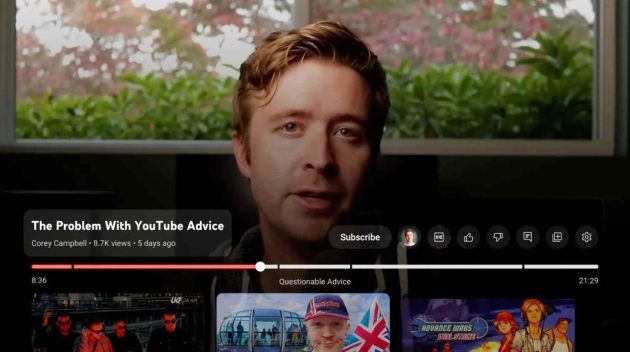

Finally a subscribe button that appears in the player
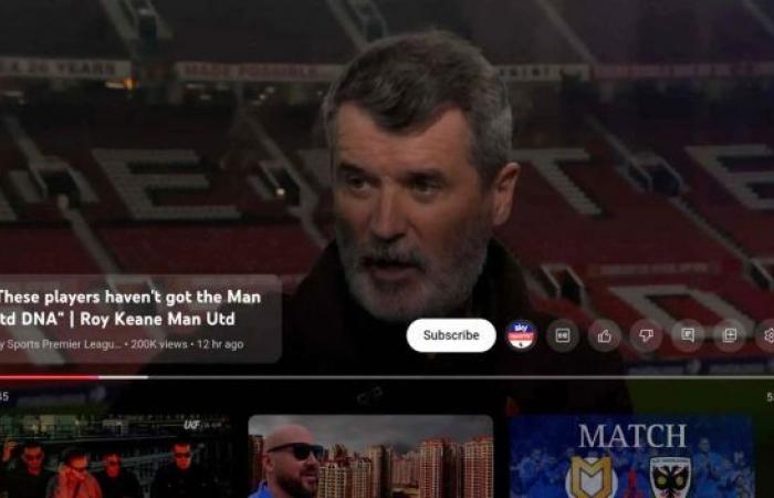
This is a feature that Android TV users have been waiting for, and there is no doubt that it will save them precious minutes. Indeed, YouTube has finally decided to include a “Subscribe” button in the video player to be able to follow a channel without having to leave the video. An option to say the least appreciable.
And even if they do not revolutionize the application in itself, it must be admitted that all these small developments put together allow the Android TV version of YouTube to getting closer and closer to the “classic” versions. In the meantime, content creators can rejoice as this should motivate many more viewers to subscribe to their channel.


Among the other new features of the latest YouTube update on Android TV, we should also note the return of boutons “I like” and “I don’t like” separated. And even if they clutter the interface a little more, they should also make navigation easier and encourage viewer engagement with the videographers. In the end, everyone is a winner.

