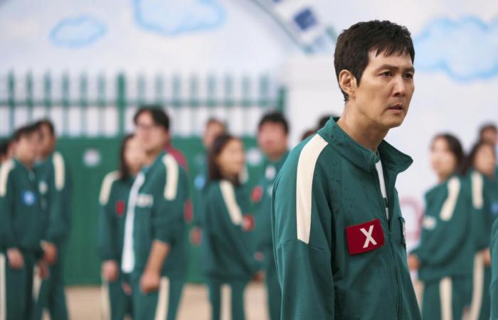
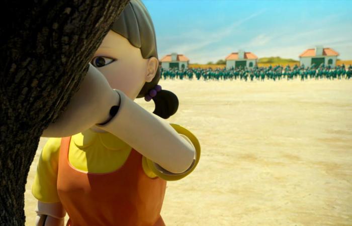
The lazy days between Christmas and New Year are usually a time for games, but it does feel like the perfect stretch to hold space, as it were, for “Squid Game” Season 2. Netflix’s pastel neon promotional blitz and brand partnerships for Hwang Dong-hyuk’s series have been at least as strong as the unfeeling incentives of capitalism to make a sequel. To the credit of director Hwang and his entire production team, they tackle the continuation of the show head-on. “Squid Game” Season 2 has a broader and darker atmosphere that matches our expanded view of the systems that make the games run.
Production designer Chae Kyoung-sun had kind of the ultimate television challenge; she and her team needed to build out a world that is intensely familiar but also different and surprising enough that even Seong Gi-hun (Lee Jung-jae) feels caught in the bright, pastel maze of the Squid Game compound when he knowingly takes up the mantle of Player 456 to bring the games down from the inside, once and for all.
More from IndieWire
Collaborating with costume designer Jo Sang-gyeong, Chae’s use of color in creating the “Squid Game” sets is a huge part of what gave the series such a distinctive take on the South Korean formula for a Battle Royale hellscape. Regardless of any new work, it’s great to see the original production team get some additional credit for the designs that have launched everything from sneakers and phone covers to a whole-ass reality series.
Chae takes the opportunity of Season 2, however, to mature the series’ child nursery in The Bad Place aesthetic to showcase the Masked Guards operating the games at the behest of the Front Man (Lee Byung-hun) and finds ways for the games to bleed into Gi-hun’s life in Seoul, too. IndieWire reached out to the Emmy-award-winning production designer to ask her how the production design continues to give the series real bite and darkness, the glossier and more innocent it looks.
This interview has been edited for length and clarity.
“Squid Game” Well Ju-han/Netflix
IndieWire: I’d love to ask about expanding the game world into the masked guards’ quarters. How did you make those spaces feel different and more sinister while keeping that familiar “Squid Game” look?
Chae Kyoung-sun: One of the new key features of Season 2 is the hierarchy within the Pink Guards. In Season 1, we only showed the dormitory for Masked Workers. But for Season 2, we introduced new spaces for Pink Guards, such as the Masked Soldiers’ dormitory, their weapons storage, and the Masked Managers’ dormitory. I wanted to show the differences in hierarchy within the Pink Guards’ world, as Pink Guards are divided into such different ranks. The spaces for Masked Soldiers (who are higher in rank than Masked Workers) are larger in size and come with a shower room.
Also, I spent a lot of time thinking about the colors for the Masked Soldiers’ space. The reason for using orange was to emphasize its more negative connotations and its symbolic meaning. I felt that deep orange is even more driven by desire and ambition than red, symbolizing a strong urge to claim and conquer.
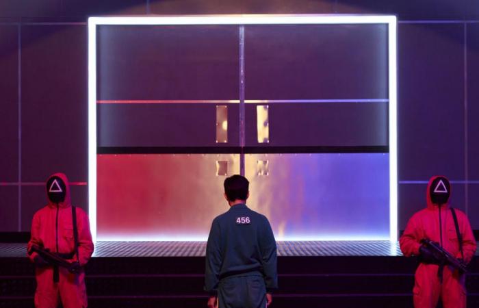
There is also a final staircase leading up to the Control Room. This space serves as the path to the Masked Managers’ dormitory and also as the setting for the players’ rebellion against the Front Man. For this space, purple was used. Purple carries many symbolic meanings, but I chose it as the color of ultimate power and placed it at the path leading to the peak of the maze staircase.
“Squid Game”Well Ju-han/Netflix
Expanding the show’s iconic staircase so that it worked for a gun battle in Episode 7 seems like a really interesting challenge. Was anything added or changed so that the firefight between players and guards would work?
The firefight at the staircase marks the beginning of a crucial event. It’s the point where tension reaches its peak, the meeting between Gi-hun and the Front Man takes place, and it sets the stage for shifts and twists in the next game and story.
In Season 1, we focused on creating a sense of vertical depth with continuous connections. This time, we designed the maze staircase to unfold horizontally, imagining wider layers while planning the movements for the shootout scenes. I wanted to incorporate the endlessly repetitive structure of Korean apartments. By using the corridor-style layout of Korean apartments as the basis for the bridge pathways, I wanted to add more variety to the action scenes between Pink Guards and rebels and showcase the ultimate design of the maze staircase.
‘Squid Game’Noah Ju Han
Speaking of mazes, I’d love to ask about the hotel in the early episodes that Gi-hun is hiding out in; how do the design choices help us understand the cost of surviving the games for him?
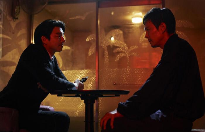
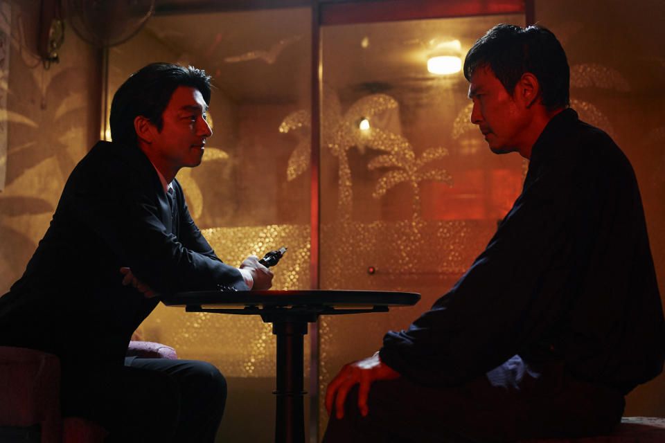
While I was reading the script, I thought the name Pink Motel had significance. It felt as if the Pink Guards and their color pink kept overwhelming Gi-hun. That is why I chose pink for the sofa that Recruiter sits on and painted the Pink Motel doors in pink. I wanted them to signal Gi-hun’s fate and imply the beginning of the Squid Game.
In Season 2, many characters face important choices, including Gi-hun. The branching corridor structure was designed to visually symbolize the concept of “choices” — the choices that characters who come to the Pink Motel face. It’s where the survivor Gi-hun lives, but it also feels like a place stuck in the past, like time has stopped.
When you enter Gi-hun’s room through the corridor, you see an empty and hollow space equipped with only the bare essentials. Using partition walls, we pushed him further into a corner, placing a mirror and CCTV monitor screen facing each other, creating the impression that Gi-hun might even be monitoring himself. By clustering the most important elements for a person — like the sleeping area — alongside surveillance elements in a space that isn’t even that cramped, we aimed to reflect Gi-hun’s psychological state, where he can never truly feel at ease.
Also, the palm tree images on the bathroom window show his longing for his family in L.A. In the shooting range, there are signs of his practice and focus: bullet marks and hand-drawn targets. Dead plants, calendars, clocks, dust, and cobwebs reflect how time stopped for Gi-hun after surviving the games.
I wondered what it would be like if, for someone living in a nightmare so realistic, reality itself appeared hazy and dreamlike. That’s why I added details like dust settled on the inside of frames Gi-hun appears in, such as bathroom mirrors and motel windows, or water stains left behind. I wanted to create a stark contrast between the vivid colors filling the gaming zone and Gi-hun’s blurry, murky reality.
‘Squid Game’NoJu Han
I’d also like to ask about the new games in Season 2. What choices were important to make so that those spaces felt novel but still used the same language as the games we’ve seen before?
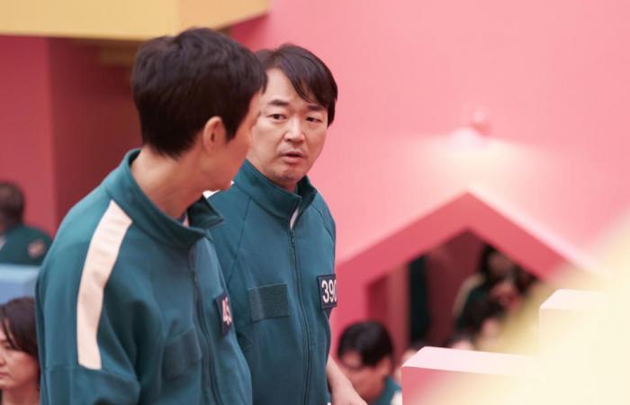
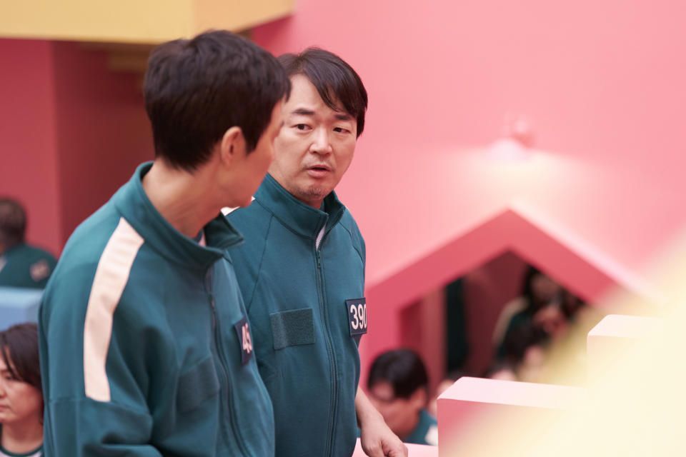
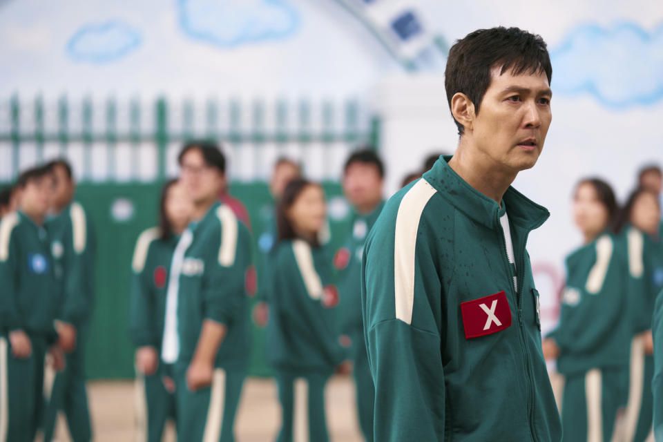
The set for the Pentathlon started from the idea of Sports Day, which is something all elementary school students look forward to during the school year. The focus is not on attacking or competing against others but rather on team harmony and unity. The set was designed to resemble an elementary school, with backgrounds composed of crayon clouds like children’s drawings. Bulletin boards, schedules, and doodles that you might find in a classroom were recreated.
The intention was for the participants in the game arena to briefly return to their childhood as they reminisced about their youth. However, in this setting, the participants who stake their lives on the game appear desperate, and if they fail, their blood splatters across the dirt ground and the beautifully painted rainbow-colored track. Objects that evoke nostalgia for the world of childhood are important elements in “Squid Game.”
‘Squid Game’Well Ju-han/Netflix
The Pentathlon is also designed with elements that align with the playground from the second game in Season 1, Dalgona. With a sky background featuring clouds that seem to be drawn in crayon by children and a playground floor finished with packed dirt, Gi-hun feels confused as soon as he enters the arena, unsure whether it is the same playground setting or not.
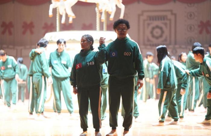
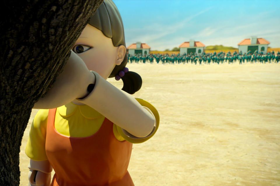
The set that I personally feel most attached to in Season 2 is the Mingle game arena. I wanted to create a space where all participants could actually play the game, and run around fearfully like pieces on a chessboard.
With the Front Man as the host for Season 2, we aimed to create a game arena that reflects his memories and imagination. Imagining a space that the Front Man, who lost his family, might have wanted to visit with his wife and child, I incorporated the symbolic image of a carousel from an amusement park into the setting. It was a new challenge, and although it appears like a festival, I wanted to present a world that is both beautifully and eerily spinning, like a festival of death.
‘Squid Game’Netflix
Were the returning sets easy to reconstruct, or was there anything tricky about recreating things like the dorm room and Red Light/Green Light? Anything that you got the chance to do differently the second time around?
Spaces that appeared in Season 1 have now become iconic spaces of “Squid Game.” I never thought we’d have to recreate them exactly as they were!
We focused on rediscovering the blueprints, the color numbers we used back then, and the finishing materials we worked on with the set team. One of the improvements we made based on the challenges during Season 1 was to make the [dorm] mattresses lighter since they were too heavy before, and we also made it easier to attach the bed covers.
In terms of scale, we were able to expand the dorm’s height and width by about 330 square meters. We paid a lot of attention to the flooring to create the O and X markings, and we conducted numerous tests with the director of photography to perfect the lighting tones for the O and X.
It would be interesting to watch Season 2 while imagining what the dormitory will look like by the end of the season. I hope viewers enjoy Season 2 and that it sparks many thoughts and discussions. Additionally, please look forward to the new sets in Season 3!
“Squid Game” Season 2 is now streaming on Netflix.
Best of IndieWire
Sign up for Indiewire’s Newsletter. For the latest news, follow us on Facebook, Twitter, and Instagram.

