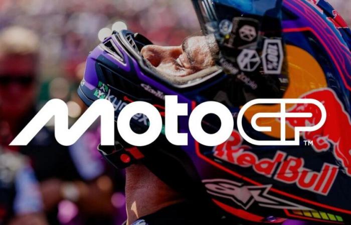
After a 2024 season which finally saw Spanish driver Jorge Martin takes the world crownthe elite of Motorcycle sport, the world championship MotoGPwasted no time in revealing his new visual identitywith a new logo and completely renewed designs.
Designed in collaboration with Pentagram (the largest independent design studio in the world), this identity is well more than a logo. It is in fact a complete evolution of the brandwhich includes illustration, movement, typography, visual and verbal identity, designed to bring MotoGP into a new era, notably marked by its acquisition by the American group Liberty Media.
The “M” of new MotoGP logo is inspired by two leaning motorcycles, close to each other on the track, the “o”s express the geometry of the wheels, while the “t” represents the rider between them. The “GP” for its part evokes the track itself. An evolution that we also find on the logos of lower categories, whether Moto2 or Moto3.
MotoGP has big ambitions for the future
Carmelo Ezpeleta, P.-DG of Dorna Sports also commented on this profound change: “ We are very excited to reveal our new identity and invite fans around the world to discover the new MotoGP. Working with Pentagram has been an incredible adventure that has resulted in a result that we hope will be unanimously appreciated by our fans. A brand is more than a logo, and MotoGP is more than a sport. The key question throughout the process has been: “What is MotoGP?”, both today and in terms of what we want to become, and we hope that this new identity communicates everything from speed to passion and everything in between. That’s MotoGP.”
France
Motorcycle


