Balancing modernity and heritage, boldness and sobriety, the decoration of 2025 is inspired by the past and recovers what remains of it to better move forward. Timeless, warm, vibrant, it presents us with spaces that we haven’t seen so enveloping for a long time.
Posted at 12:00 p.m.
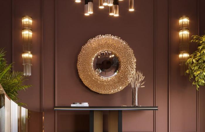
Mocha Mousse: like a desire for stability
At the end of each year, Pantone reveals the color that will influence future design and decor, according to its predictions. Mocha Mousse (Pantone 17-1230) is the one on his radar for 2025. Rich, modest and sophisticated, this shade is one that injects a sense of comfort into decors. In line with the trends of recent years and a certain quest for authenticity, it draws on the nature of earth and bark tones. Mocha Mousse also evokes simple and gourmet pleasures, such as coffee and chocolate, and is part of the new neutrals. It pairs with bright color accents, like pink and turquoise, as well as soothing shades of beige, cream and terracotta.
Styles that are gaining popularity
PHOTO PROVIDED BY BEAUTITONE
The vibrant hues are expressed in the decors.
Passion colors
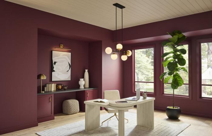
Worn by generations Y and Z, vibrant colors breathe dynamism into the decor through accessories, textiles and accent elements. According to a survey conducted by Behr Painting, people are ready to embrace color like never before: approximately 69% of Canadians would consider painting a room or wall a shade of red. Rich shades of deep red, like dark cherry tones and burgundy, are among the favorites.
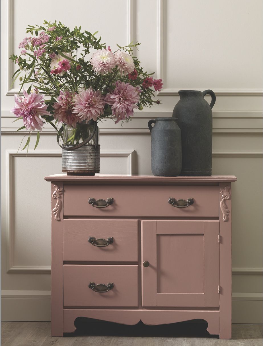
PHOTO PROVIDED BY BEAUTYTONE
A piece of furniture painted in the color Bloom from the BeautiTone 2025 color collection
Custom decor
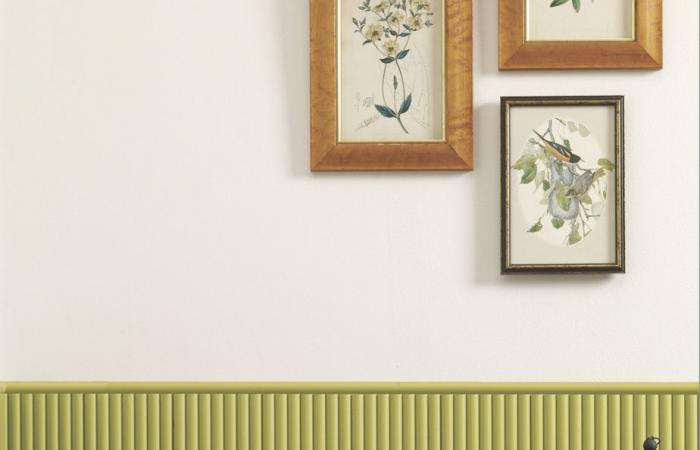
Started during the pandemic, personal expression in decor is reinforced in 2025 with even more “handmade” accents and personalized touches that move away from generic and expected decor. Make way for painted furniture, murals and contrasting borders.
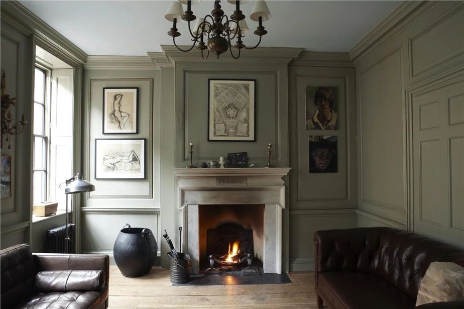
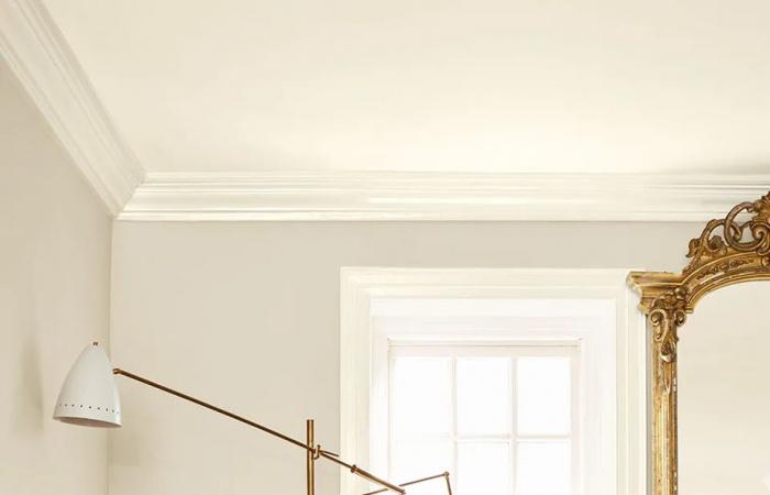
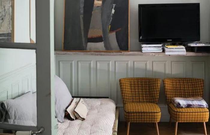
PHOTO FOURNIE PAR FARROW AND BALL
The revival of Rococo and “Castle Core” styles gave way to pastels and flourishes.
L’opulence d’avant
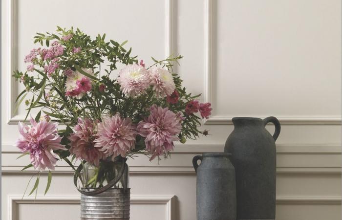
We are witnessing the rebirth of the Rococo style which seduces with its exuberance, its fanciful details and the frivolity of its forms. The trend is giving way to floral patterns, furniture with elegant curves and pastel color palettes that bring a touch of luxury and femininity to interiors. The antique craze also finds a vehicle in the “Castle Core” aesthetic, which incorporates castle-inspired elements, such as chandeliers, stonework and wallpaper.
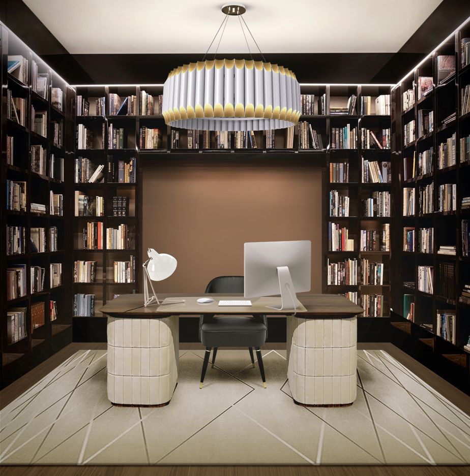
PHOTO PROVIDED BY PANTONE
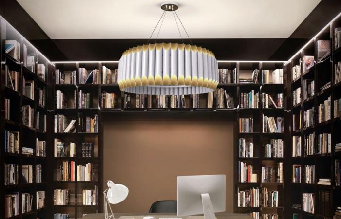
Maximalism is gaining ground.
Maximalism
Scandinavian style continues to be inspiring with its bright, functional spaces, natural materials and neutral color palettes. However, refined decors are slowly being replaced by eclectic and warm environments, according to the latest Pinterest report. Caution gives way to boldness with a layering of patterns and textures, and the integration of retro elements.

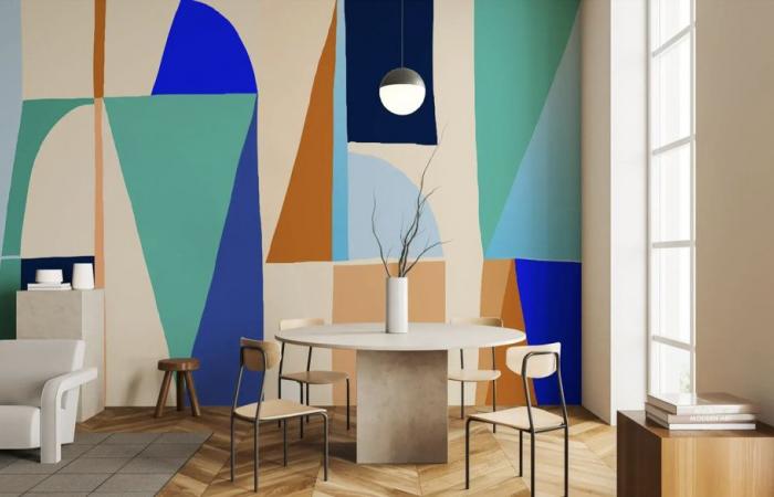
PHOTO TAKEN FROM THE MURAL CONCEPT SITE
The Memphis style presented here as a mural
Back to the future
In a completely different aesthetic, the Memphis style of the 1980s manifests itself through the use of geometric shapes, bright colors and playful elements that bring a futuristic and eccentric touch to spaces.
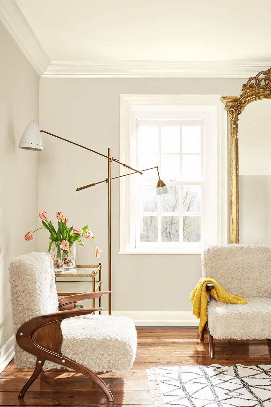
PHOTO PROVIDED BY BENJAMIN MOORE
Scandinavian style is heating up.
Slowthe decor
Naturalness always comes back at a gallop with its shades of blue and earth, as well as its authentic, ecological and sustainable materials (wood, stone and organic fibers). This trend, established for several years, reflects increased ecological awareness and a desire to create authentic and serene spaces that stand the test of time. In this spirit of “ slow decoration”, we think about recycling what we already have and promoting second-hand objects.
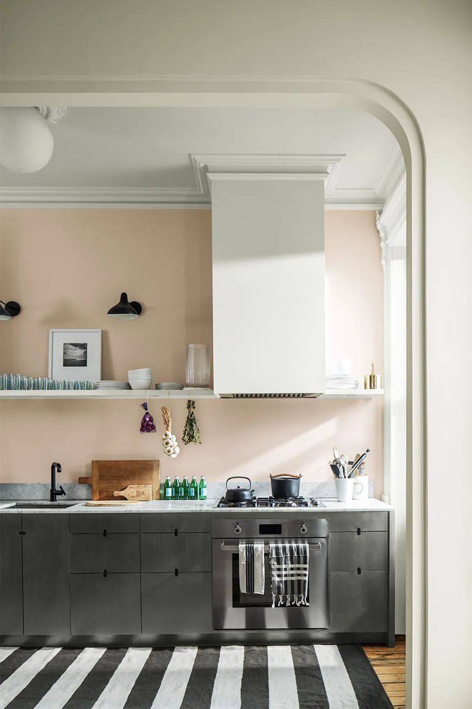
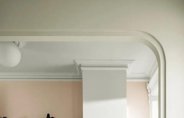
PHOTO PROVIDED BY BENJAMIN MOORE
Curves return both in architectural details and in furniture design. On the wall, color Chiffon from Benjamin Moore’s new 2025 collection.
Long live the curves
Architecture and design are increasingly cutting corners. Furniture as much as spaces adopt soft shapes which contrast with the straight and rigid lines of the past.
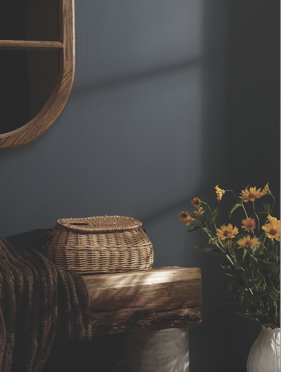
PHOTO PROVIDED BY BEAUTITONE
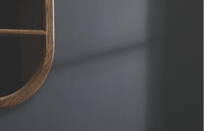
The Zen spirit is displayed through choices of natural materials and soothing colors like steel blue.
Zenitude and multifunctionality
Today’s life calls for efficient and flexible use of living areas that are designed to meet multiple needs. At the same time, the increased presence of technology in personal environments encourages us to find solutions to integrate it discreetly into space or furniture, for example with discreet televisions and furniture integrating wireless charging. In this context, serenity becomes a priority and we see more and more spaces intended for well-being appearing.
2025 in colors
For the year 2025, a number of major paint brands are unveiling their flagship colors dominated by tones of plum, gold, brown, steel blue and sage green.
-
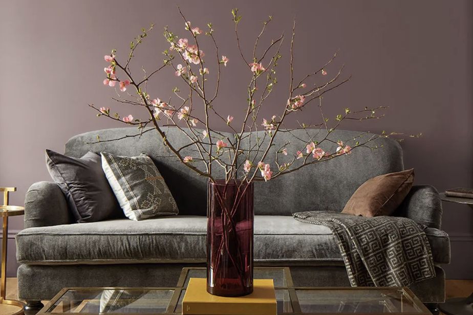
PHOTO PROVIDED BY BENJAMIN MOORE
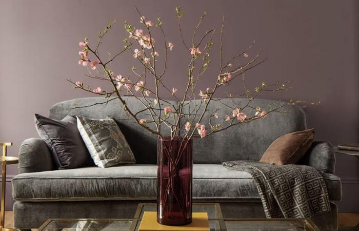
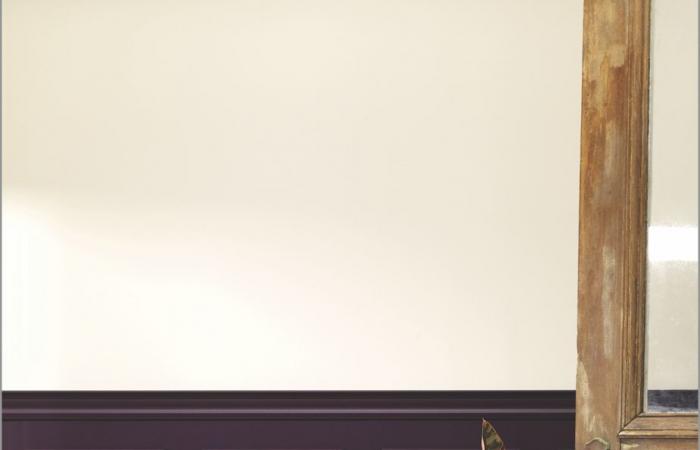
Benjamin Moore chose Cinnamon Slate (2113-40), a versatile shade that combines notes of heather-inspired plum with those of velvety brown.
-
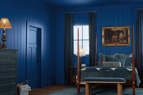
PHOTO PROVIDED BY VALSPAR
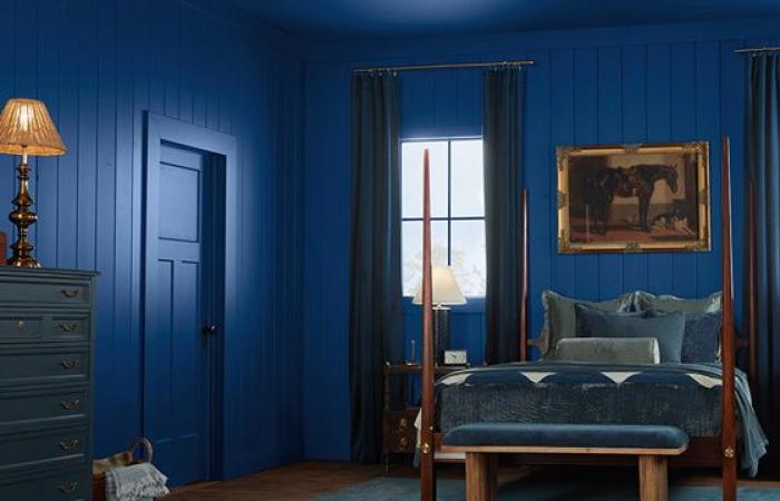
It is an ultramarine blue presenting itself under the names Epic adventure (V073-6), Olympus Blue (109G) and Rappel (8002-45G), depending on where you get it, which dominates the trends at Valspar. The company thus promotes values such as consistency and trust.
-
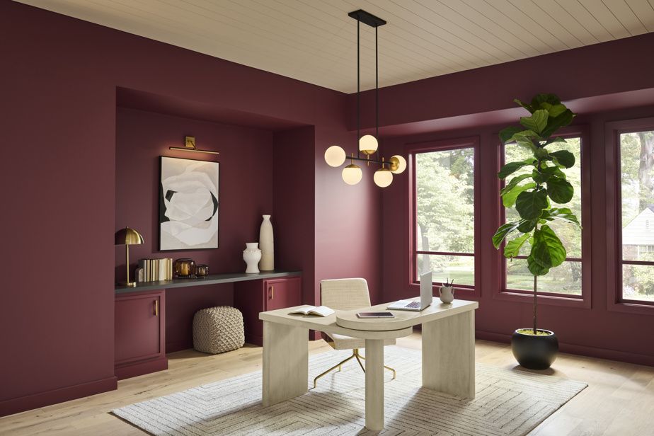
PHOTO PROVIDED BY BEHR
Behr designated Rumors (MQ1-15) as its color of the year 2025. This welcoming hue adds a touch of sophistication and history to the space.
-
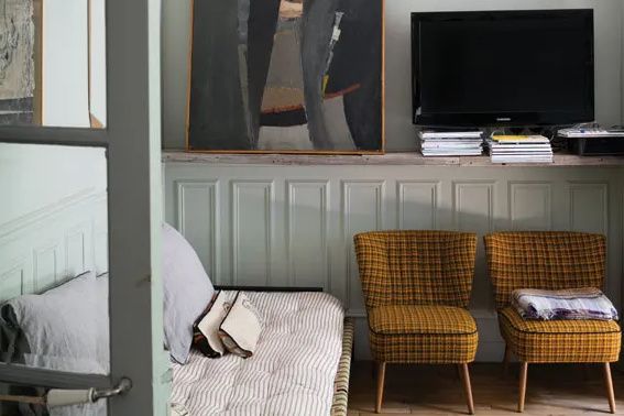
PHOTO PROVIDED BY FARROW & BALL
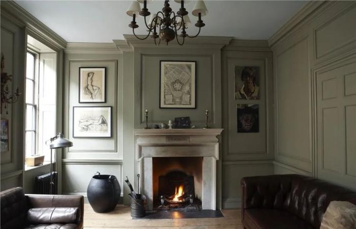
Oscillating between gray and sage green, depending on the lighting, French Gray (No.18) from Farrow & Ball is one of the new neutrals that add softness and calm to the decor.
-
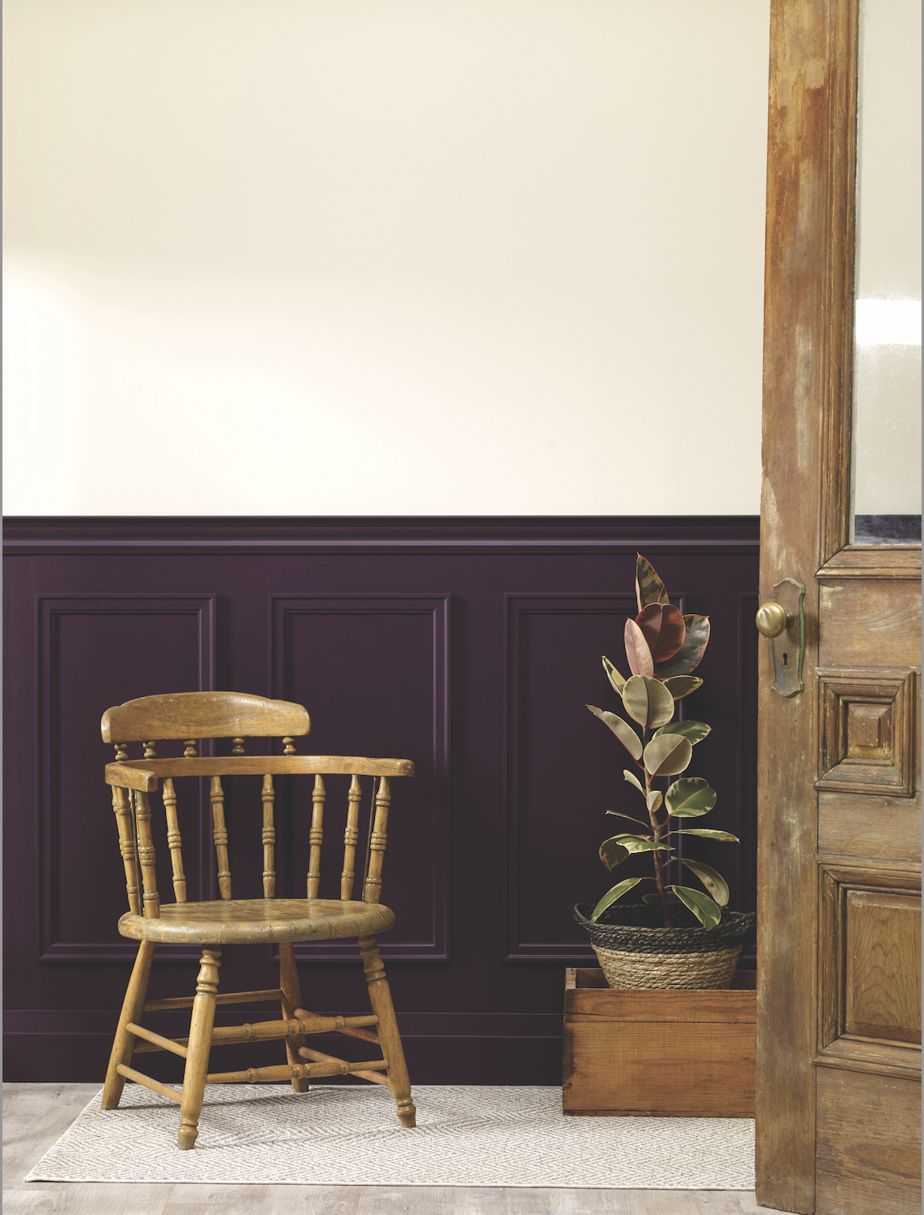
PHOTO PROVIDED BY BEAUTITONE
Centerpiece of BeautiTone trends, Midnight Flora (TR25-3-3) is a charismatic and mysterious color that evokes the feeling of a mesmerizing garden at dusk.
-
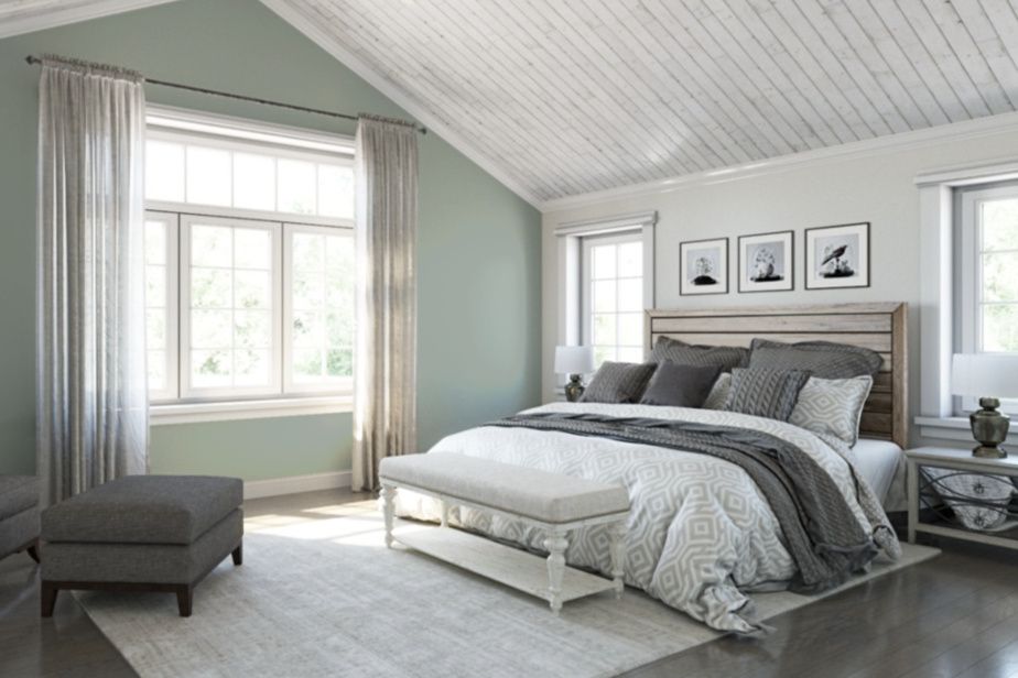
PHOTO PROVIDED BY SHERWIN-WILLIAMS
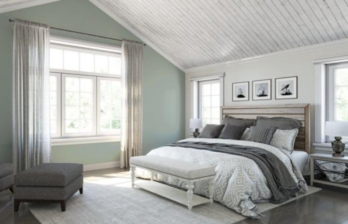
Sherwin-Williams opts for the discreet luxury of Quietude (SW-6212), a calming sage that pairs with a collection of golden, brown, beige, steel blue and mauve shades.
-
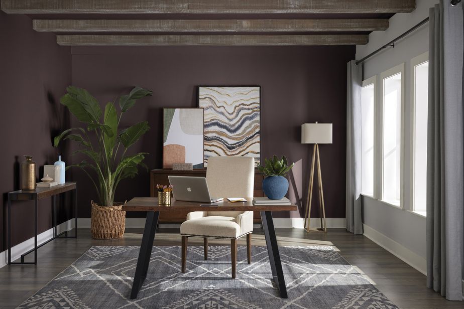
PHOTO PROVIDED BY SICO
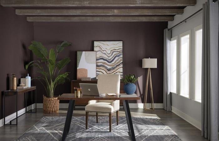
Sico, for its part, offers Starry Night 6044-83, a deep, earthy mauve that creates an enveloping effect.
1/7

