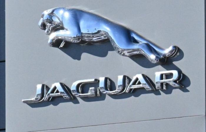
To support its transition to all-electric, the famous British manufacturer unveiled on Tuesday an exuberant and colorful new brand image which dismays its fans.
Revolution underway at Jaguar. Faced with plummeting sales, the famous British manufacturer of elegant sedans has completely redesigned its brand image to support its transition to all-electric. The old logo «JAGUAR» in gray capital letters is no longer. It is replaced by a new typography, «jaGUar»Who “demonstrates the unexpected by harmoniously mixing upper and lower case” according to the brand, while being more faithful to the posh British pronunciation. Another change, the historic monogram with the jaguar head gives way to a very refined golden badge, decorated with only the letters «j» et «r». As for the famous leaping feline emblematic of the shape, the “leaper”he was “reimagined” to decorate other parts of the car.
All these changes were revealed this Tuesday through an astonishing advertising spot much criticized by Internet users and Jaguar fans, who considered it far too «woke». «Ridicule», «abominable»
This article is reserved for subscribers. You have 75% left to discover.
Black Friday
-70% on digital subscription
Already subscribed? Log in


