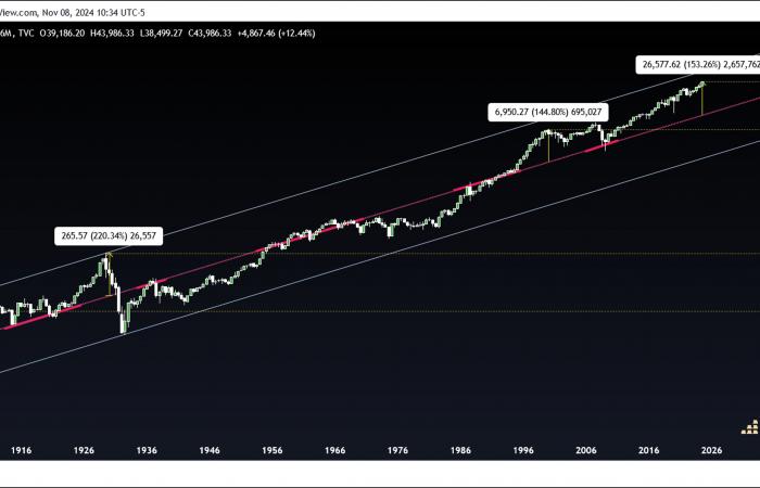
This week we're going to analyze some interesting long-term gold and Dow Jones price charts to see how technical analysis suggests they MIGHT perform in the decades to come. While there is a fair amount of speculative analysis in both charts, my goal is to combine creativity and open-mindedness with historical price movements, in order to highlight potential long-term trajectories that , if they materialize in the coming years, will not surprise you.
The first chart we are going to analyze is that of gold. It clearly shows that the metal has been trading within a four-point blue channel that began when gold was revalued to $35 in the 1930s, marking point 1. Point 2 formed early from the 1970s, when gold began to be traded freely; point 3 corresponds to the peak of the frenzy of 1980; and point 4 at the 2001 low — all historic moments for gold. Next, it is worth noting that gold has been trading inside a more restricted yellow channel, initiated at point 1 in the 1990s. The four existing points in these channels are not speculative. However, I will take some creative liberties with whether, how, and when each of them will reach point 5.
IF we were to see a fractal movement of the 1970s gold rally, this is what would happen:
- Gold would perfectly test the trend line connecting the 1980 and 2011 highs,
- Gold would reach point 5 of the blue channel over the next decade, around $20,000,
- Gold would then make a perfect backtesting of the yellow channel from the previous point,
- Gold would reach the following prices in this order: $5,000, $2,500, $20,000, $10,000.
There is no guarantee that gold will follow this fractal trajectory. However, if it did, it would make perfect sense from a technical analysis perspective. The question you now need to ask yourself is: are you prepared to endure this evolution over the next 10 years?
The second chart is that of the Dow Jones. You will find that its entire trading history can be interpreted as an ascending channel, defined more by the price action around the middle line than by its upper and lower lines. This is a classic example where the midline highlights a channel that many don't notice. Then you will notice that every time the price moves extremely far away from the midline, it eventually returns to it slowly and gradually. It may take decades before the price of gold regains and sustainably exceeds its previous peak. The 1899 peak was not definitively exceeded until 1933! The 1929 peak was only eclipsed in 1954, and even the 2000 peak was not broken sustainably until 2012. Note that in each case the price fell below the channel's midline. eclipse its former peak.
Once again, the Dow finds itself historically far from its median line. No one knows exactly when it will return, but one thing is certain: at current levels, the Dow would cross the center line of its channel in 2042, that is to say in 17 years! By historical standards, this value would not be unusual at this date. Looking at the graph, you might even think that this makes perfect sense. Even more worrying, a decline towards the lower line of the canal, which does not exceed 10,000 before 2037, would be just as logical!
To meditate.
Reproduction, in whole or in part, is authorized provided that it contains all hypertext links and a link to the original source.
The information contained in this article is purely informative and does not constitute investment advice, nor a recommendation to buy or sell.
- -


