Google is updating its Messages app with a text bar redesign. After a first change canceled at the start of the year, the firm seems to have found the arrangement that suits it.
Google likes to change the interface of its applications. Sometimes it's for the better, with a necessary modernization of the whole thing which makes use more pleasant. From time to time, the changes are clearly confusing, not to mention painful. It even happens that the Mountain View firm launches a new design only to ultimately reverse its decision, without us really knowing why.
Read also – Google Messages: this new backup and restoration function will make your life easier
This was for example the case with the text entry area In Google Messages. If you open the application now, you will see the following layout at the bottom of the screen: on the left a “+” which allows you to insert a file and the open gallery/take photo button, then the bar itself which contains shortcuts to emojis and recording audio.
At the end of 2023, this order is turned upside down before finally returning to the one we know today. A year later almost to the day, Google seems to have found the right formula and is once again offering a different design.
The Google Messages text bar will change, discover its new design
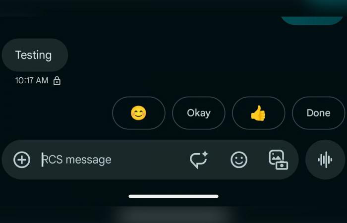
Spotted in the latest beta version of messaging, the redesign takes up last year's idea. It can be seen in the screenshot below. : the text bar aligns to the left of the screen and starts with the “+”. Still inside the input box come the AI-assisted writing, emoji, and open gallery/take photo buttons. Only the recording of an audio message remains separate, on the far right. The shortcut turns into a send button when the text is ready to go.


It will obviously take a little time to get used to this provision again, if Google does not backtrack yet. No global deployment date is known, as is always the case with this type of update.
Source : 9to5Google


