For more than twenty years, Western analysts have been seduced by this method born in Japan shortly before the Second World War. With expert Patrick Riguet.
Understanding indices or other financial assets at a glance is a valuable asset for any professional active in the markets. Originating in Japan, a method has established itself worldwide: the Ichimoku Kinkō Hyō method. Independent trader and expert in technical analysis of stock market curves, Patrick Riguet reveals to us all the mysteries of this technique, invented at the beginning of the last century.
What is the ichimoku indicator? Can you recall its origin and history?
Ichimoku Kinkō Hyō emerged in Japan between 1932 and 1939, the fruit of the research of Goichi Hosoda, then director of the stock market section of the newspaper “Miyako”. In 1936, under the pseudonym Taro Sagami, Hosoda presented for the first time his work on the Tenkan Sen, applied to the prices of the Shinto market, one of the main markets of the time on the Tokyo Stock Exchange. This concept, called “Shinto Tenkan Sen”, constitutes the basis of what will become Ichimoku Kinkō Hyō.
In 1941, Hosoda left the newspaper “Miyako”. After World War II, he published an updated version of his Ichimoku Kinkō Hyō in the journal Japan Securities, this time using the pseudonym Ichimoku Sanjin. At this time, research on financial markets remains very
confidential, and its work only affects a restricted circle of initiates. Subsequently, Hosoda chose to keep his advances secret, only revealing the complete version of his system in 1969, in the form of several volumes.
These volumes met with notable success among an informed public, although this success must be qualified by the context of the time, where few non-professionals were interested in the stock market. The 1969 editions quickly sold out, but no new printings were made for almost a year.
decade. Eventually, Hosoda’s grandson, the rights holder of the original work, allowed Korean publisher Iremedia to translate and publish Hosoda’s entire work in Korean, making this tool accessible to a new audience.
When did Western markets become interested in Ichimoku Kinkō Hyō?
In the West, Ichimoku only began to be explained in depth in the early 2000s, primarily through works published in English. The first of these books, “Ichimoku Charts” by Nicole Elliot, helped to popularize this tool, followed in 2010 by “Cloud
Charts” by David Linton, who took a deeper dive into the explanations. These two works marked the beginnings of contemporary research into the functioning and use of Ichimoku, although they relied on already existing work.
Starting in 2010, a large number of contributors from various parts of the world began publishing their research on Ichimoku. These publications, in the form of books, blog articles, forums or videos, have often strayed from Hosoda’s original teachings,
offering modern and sometimes very personal interpretations. It was only from 2019-2020 that the original teachings of G. Hosoda resurfaced, although they may have circulated confidentially before. This rediscovery led to a division between two main schools. The first seeks to remain faithful to the foundations laid by Hosoda, while the second favors a more modern approach and sometimes far from the original principles. This opposition reflects the different uses and interpretations of this tool in a contemporary context.
How does this Ichimoku indicator work? What does he analyze on a stock market curve?
The Ichimoku Kinkō Hyō, which literally means “see the balance of a chart at a glance”, is a technical analysis tool intended to quickly interpret stock charts. This indicator offers a synthetic vision of support and resistance levels, the trend (whether bullish, bearish or neutral) simultaneously over several time units.
Using Ichimoku, an investor can evaluate price action by taking into account past, present and future information. This makes it possible to optimize the timing of entry and exit of positions, by identifying opportune moments to buy or sell. This tool stands out for its ability to provide a comprehensive analysis, combining both visual simplicity and analytical depth, making decision-making more efficient and faster.
We also owe to Japan, the tool of candlesticks… How does this other tool work?
Japanese candlesticks are a visual method of technical analysis that represents the price movement of a financial asset over a given period of time.
Candlesticks allow you to quickly read market behavior by identifying specific configurations (or patterns) reflecting investor sentiments, such as hesitation, confidence or fear. These patterns can indicate a trend reversal or continuation.
Thanks to their clarity and wealth of information, Japanese candlesticks are an indispensable tool for analysts, providing a precise view of market psychology and facilitating decision-making.
The use of Japanese candlesticks proves particularly powerful when combined with the Ichimoku Kinkō Hyō. Reversal or continuation patterns, spotted on key levels identified by Ichimoku, offer formidable precision and efficiency in market analysis.
Is there a reason for this country’s preeminence in the graphical analysis?
Rice merchants in the Edo period quickly understood the importance of predicting price fluctuations, leading to precise analysis systems such as Japanese candlesticks, considered the precursors of modern technical analysis. For decades, the
Research in technical analysis remained confidential in Japan. This secrecy has allowed the country to develop unique and independent expertise in this field, little influenced by Western methods until their later introduction.
What do Ichimoku and Japanese candlesticks say about Wall Street these days?
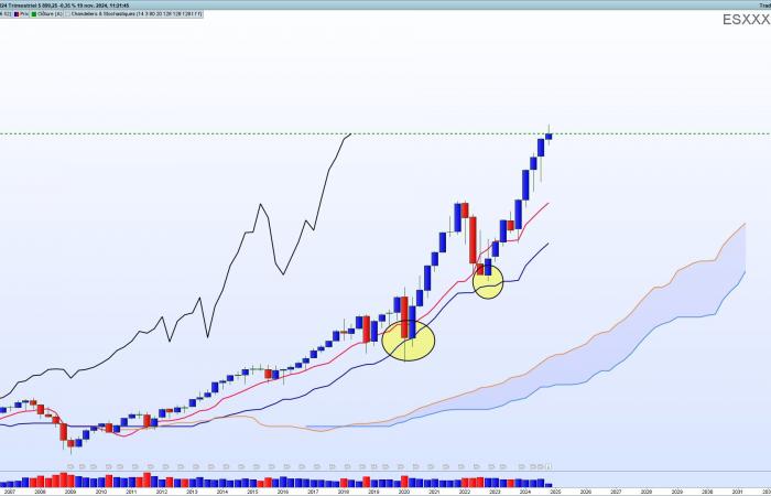
For the S&P 500 Future, the quarterly chart shows a powerfully bullish but overbought trend. Indeed, the gap between prices and the tenkan sen (red line) is excessive. A long-term investor, already buying this index, can maintain his position as long as the kijun sen (blue line) continues to play its supporting role perfectly.
We also note, in the yellow ellipses, the quality of the support offered by this line of the Ichimoku. The kijun sen has not been broken since 2011. An investor not in a position should wait for a decline at least to the red line (tenkan sen) before considering a purchase.
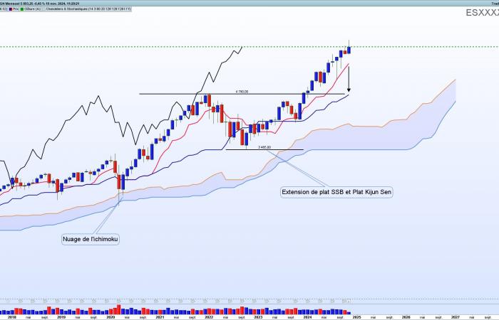
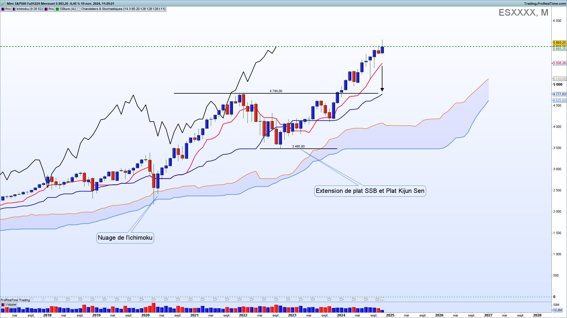
The monthly time unit confirms the analysis carried out on the quarterly chart. The gap between the Tenkan sen and the Kijun sen (red and blue lines) indicates a significant overbought pattern. To invest for purchase, you should wait for a decline at least until the Kijun sen.
It is also possible to indicate the precise ancient support areas offered by the Ichimoku (Ichimoku cloud legends and SSB dish extensions and Kijun sen dish).
And what about the SMI in Switzerland?
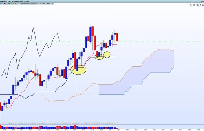
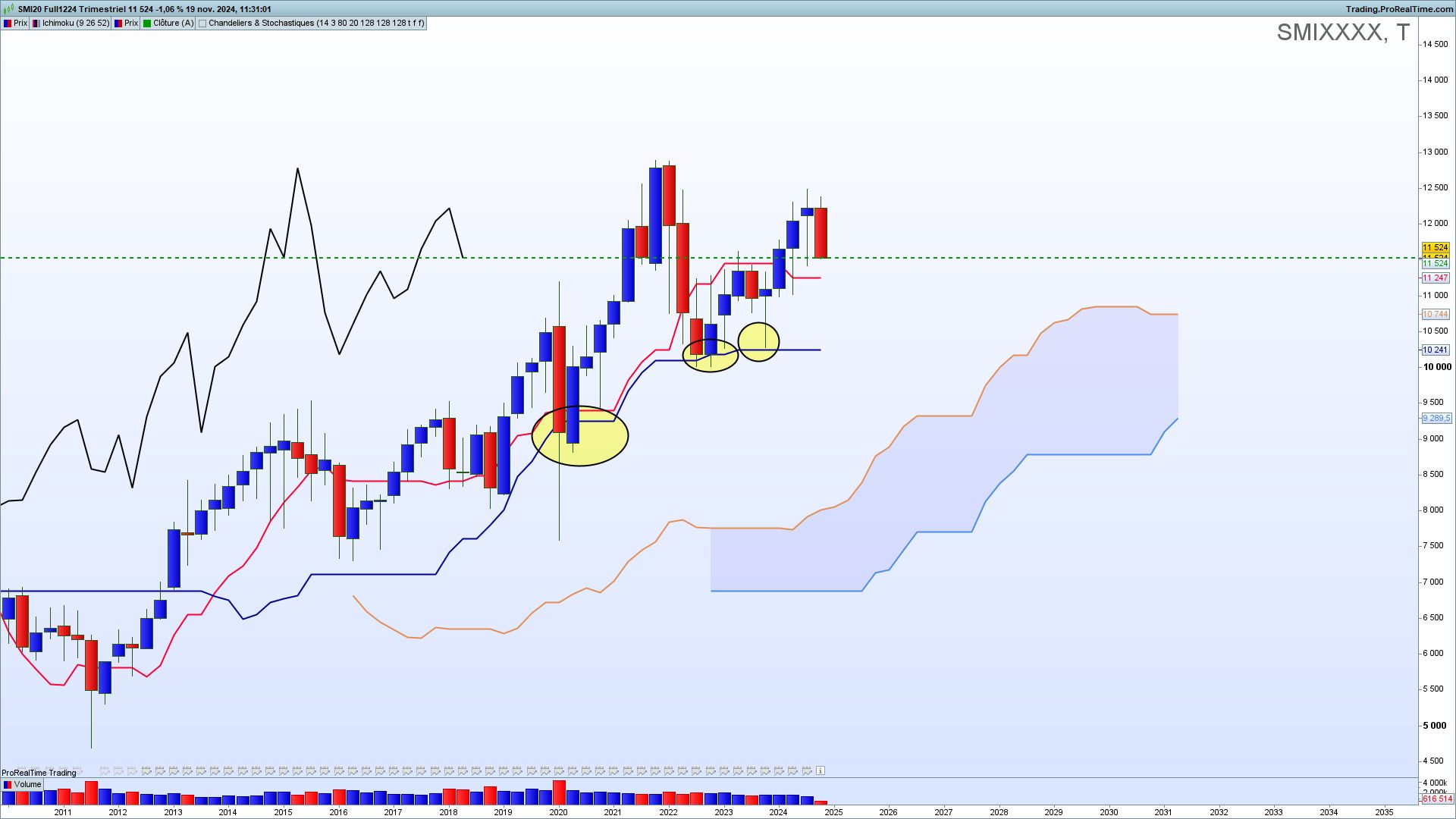
Let’s start with the analysis of the future SMI on a quarterly chart. Despite a slowdown in the trend, it remains bullish. The first level of Ichimoku support is not broken (Tenkan sen, red line). Nonetheless, it is probably unwise to buy until prices
do not fall back on the Kijun sen (blue line). Note the perfect role this line plays as support (yellow ellipses).
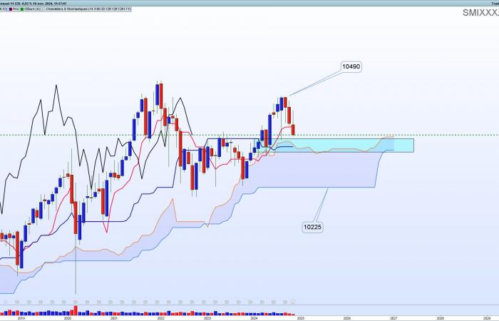
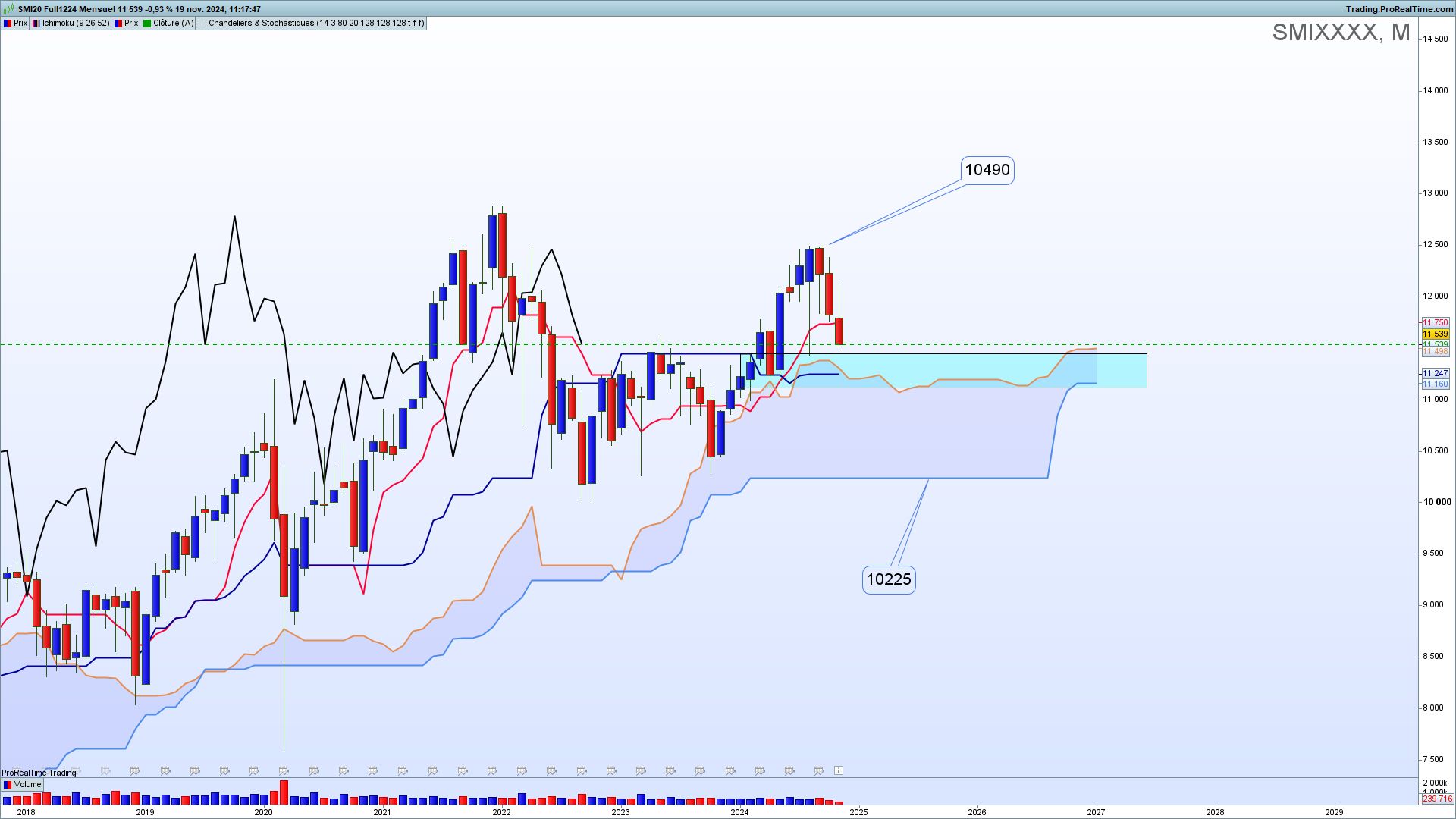
In a monthly dimension, the cloud becomes flat (horizontal), indicating a clear weakening of the trend and a probability of “range” (lateralization). The area framed in light blue must absolutely hold to trigger a raise. Below this zone, the probability that
prices reach the zone of 10,225 points is strong.
On the contrary, in the event of a rebound on the equilibrium zone (blue rectangle), a return to 10,490 points followed by historic highs is probable. It is in this area that it will be appropriate to study Japanese candlestick patterns to determine the probability of a bearish breakout or a bullish rebound.
How reliable are these two graphical analysis tools?
For someone who has given himself the means to learn how to use them perfectly, these tools are very reliable. Of course, nothing is infallible, but they allow you to establish price projections with a high probability of success.
Compared to other available tools, are Japanese tools more reliable?
Personally, I believe this and see it regularly. However, it all depends on the individual. Ichimoku and Japanese candlesticks allow for quick, efficient and reliable analyses. These are very visual tools.
However, they may not be suitable for everyone; other analysts will prefer chartism, for example, this other tool which consists of studying a stock chart in order to detect recurring geometric figures.
As we observed above, the great advantage of Ichimoku is its simultaneous use over several time units, which reinforces the quality of the analysis.
We hear that graphic analysis is losing momentum, particularly within banks. After 55 years, do you think that Ichimoku retains its interest in the current context?
I am convinced of it. If a listed company has solid fundamentals, waiting for an ideal configuration determined by graphical analysis allows you to obtain excellent entry timing and avoid many disappointments.
To answer the question of the effectiveness of old tools, I would say that if a tool more than 55 years old is used more and more in technical analysis, it is because it must be particularly reliable and effective. And what about the Japanese candlesticks dating from the 18th century today massively displayed on most analysts’ and traders’ charts?
What impact do you think new forms of AI will have on your area of expertise?
Quite honestly, I have no idea. I worked with specialists in machine learning and supervised learning, convinced that they could reproduce human analysis via Ichimoku. They didn’t succeed. So far, AIs and algorithms fail to use Ichimoku correctly.


